Brand Identity, Website Design________
Youth Leaders Davos
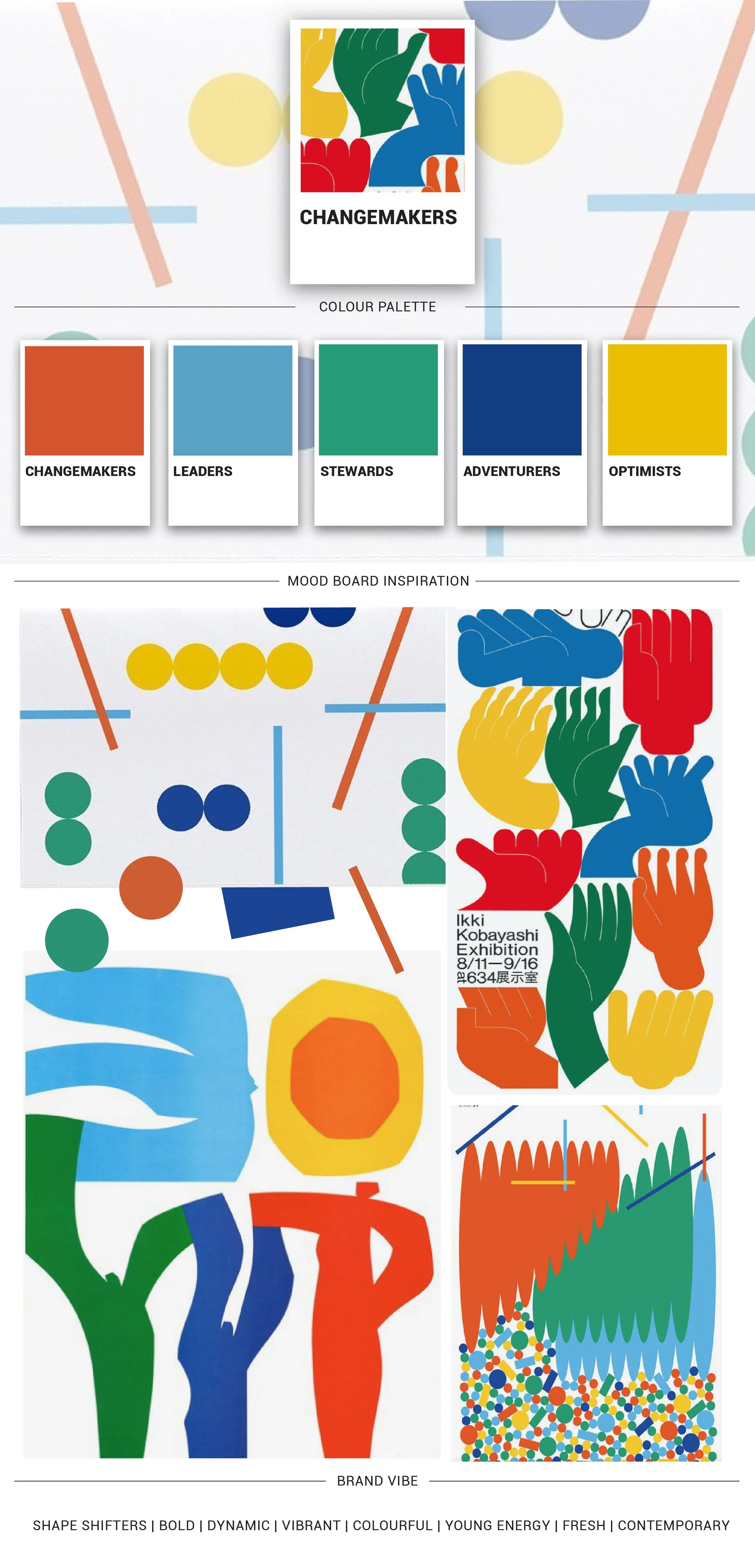
Youth Leaders Davos needed a brand that could hold a lot. Youth energy and global credibility. Davos as a location without being defined by it. The idea of change makers, young leaders bridging the gap between East and West. That's a significant brief for a single mark.
April came to us with a clear programme and a tight timeline. The identity needed to work across locations beyond Davos, appeal equally to youth participants and the parents making the decision, and carry both ambition and warmth in the same breath.
The process started where it always does - brainstorming and sketching, trying everything and discarding most of it. Mountains. Compasses. Globes. Torches. Letterforms. Each concept tested against the brief until something finally clicked.
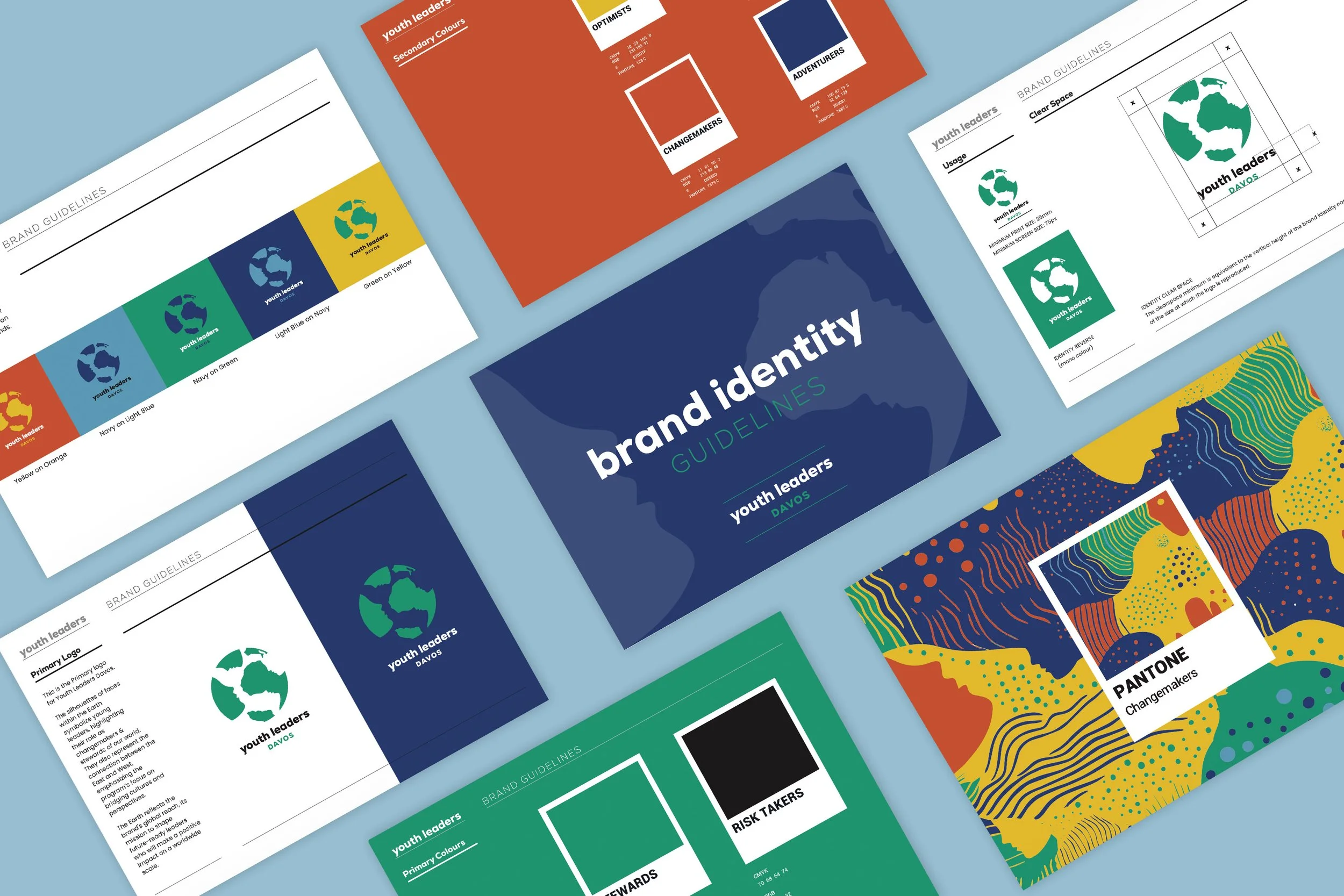
The final logo uses the Earth as its primary form. Embedded within it, in negative space, are multiple silhouettes of faces - young leaders and changemakers, side by side. East and West, held in a single mark. One idea, quietly carrying many.
April had a hard time choosing between the concepts, which is exactly where you want a client to be.
"Thank you very much for creating the logo and website for Youth Leaders Davos. I am very pleased with your talent, professionalism, and speed." — April Swando, Founder, Youth Leaders Davos